5 big mistakes designers make on their website (that stop clients booking)
I hate to break it to you, but your website is putting clients off…😬
Most design websites I see are self-indulgent and built more for the designer and less for the potential client.
Here are some of the big mistakes I see designer's making…
1: The website is aesthetic but low on the content
The website is very aesthetic but low on the content that a potential client is actually looking for.
Your website is not only a showpiece, it’s also meant to be a conversion piece - i.e. something that is converting visitors into potential clients.
Your website needs to be less about you and more about your potential clients and what they are looking for help with.
Tip: Your website isn’t only a digital portfolio - it also needs to contain the content that converts visitors into paying clients.
2: The website is hard to understand
Website visitors have to think way too hard to work out exactly what you do, who you help and whether you can help them or not.
Some websites are so aesthetic they are off-putting to clients because the client immediately thinks “these designers are already too busy/too expensive/too booked up”.
Or some just think you will be too stuck up to work with (sounds harsh but I’ve heard this so many times from clients I worked with!)
Tip: Make it clear what types of clients you work with (e.g. do you have a minimum budget?) and also whether you have capacity to take on work at the moment. Also make sure your website balances out being aesthetic and on brand, with being approachable.
3: It's hard to understand what the next step should be
Most design websites have no clear call to action and provide no indication of next steps for working with you.
For example, do you want potential clients to book in for a call, fill in a form, download a freebie you might have, pay for a design consultation, purchase something from you??
Tip: The first step for all of my projects was a paid initial design consultation. My website had a booking form and payment system and it was clear that first step was to book in for a consult. All CTAs on my website pointed to my booking form. New clients then booked in automatically while I was busy working on other projects or seeing other clients. This was a passive way of bringing in new potential clients.
4: No transparency around pricing
Most designers don't put pricing up on their websites for a range of reasons.
But think about your own purchasing behaviour. When you go to a business website what are you generally wanting to know in order to make a purchasing decision?
It’s most likely - how much does this cost, can I afford it and how does it work?
Are you sharing the information your potential clients are likely looking for? If not you're making it too hard for them to do business with you.
Tip: if you don’t want to add pricing at least put in a minimum budget to work with you - this will help weed out time wasters and encourage real buyers
5: There is a lack of transparency around process
Most design websites have a lack of transparency around process.
Again think about your own behaviour when you are purchasing things.
If you don't understand what you're getting, how it works or how to get started are you more likely purchase or not purchase?
Give visitors the information they are looking for!
Tip: share what it’s like to work with you step by step - this will help take some of the ‘fear of the unkown’ out of approaching you.
If you're making any or all of these mistakes you're likely leaving a lot of money on the table as you are making things too hard for people.
The result?
Potential clients end up leaving your website and going to one where they can get their questions answered easily. (Even if that designer may not be as talented as you!)
Thanks for reading and catch you in my next post :)
Clare x
Dr Clare Le Roy
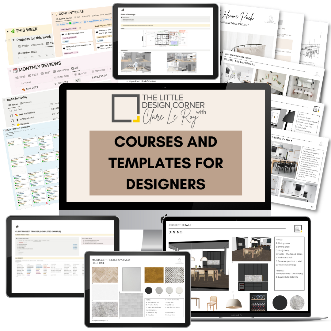
Courses and Templates for Designers and Architects
DO YOU WANT TO….
Improve your professionalism?
Find more clients?
Bring in more revenue?
Create better systems and processes?
Then check out my business courses and templates for designers and architects.
These courses and templates leave you with work done - not just a long list of things you need to do next. We have a really strong focus on taking action and getting things created that improve your business.


